
English
Trend Focus
Retail Window Display Design: Where Color, Lighting, and Visual Art Meet
addtimes:2026-01-03 click:30 author:Gimsun
On the hustle and bustled street, what makes you pause? The scent of snacks, a famous spire, the flow of the crowd, or perhaps a retail window display. These silent narrators—color and line—compose a brilliant drama before you are even aware.
In window display design, color is the script, while lighting is the director. Color strikes emotions directly and shapes the first impression, while lighting subtly steers the viewer's gaze, guiding how one perceives both color and space. Together, they weave an irresistible allure for the display. The success of a master designer doesn’t rely on intuition, but rather on following the classic 60-30-10 color rule: 60% for the main color, establishing the overall tone; 30% for the secondary color, creating layers and transitions; and 10% for the accent color—such as a bright red lipstick or a table lamp next to the sofa—which instantly enlivens the scene.
Based on this principle, the narrative strategies of window display color can be divided into three categories:
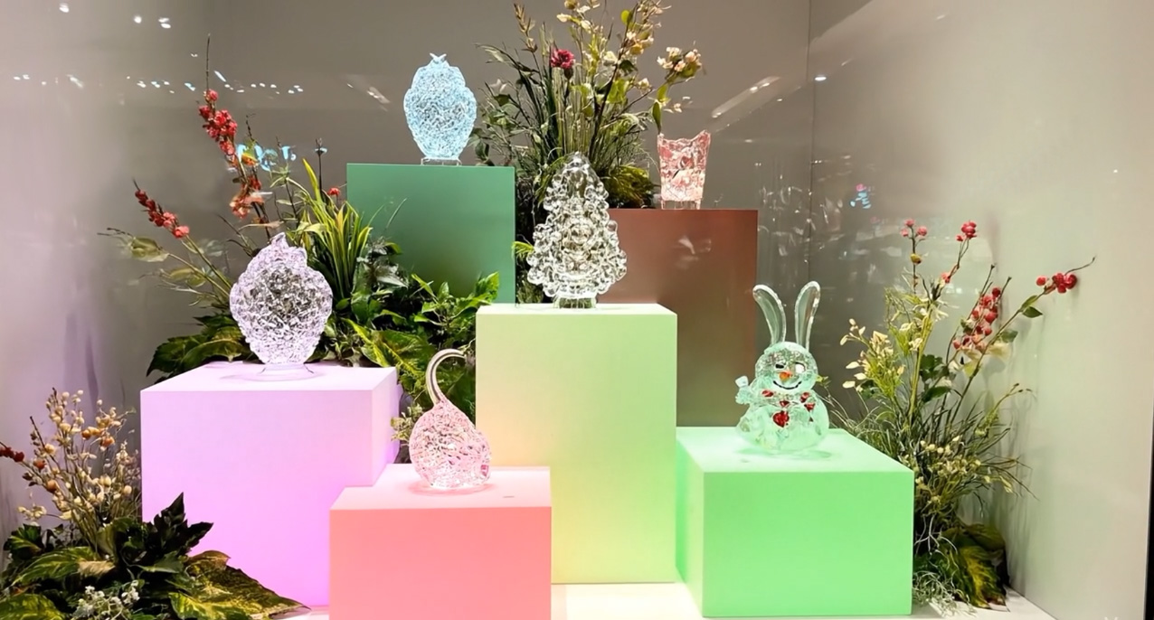
Gradients: A color scheme unfolds from light to dark, using shades like grayish-white, off-white, and oatmeal that gradually blend into each other. This delicate textural difference enriches visual layers and conveys a peaceful and tranquil spatial mood.
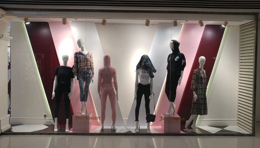
A Dramatic Highlight: Introduce a small area of complementary color contrast, like a touch of orange against a dark blue background. The collision of calmness and passion strongly attracts the viewer's attention, making it suitable for new products or flagship items.
Accentuation: Against a canvas of neutral colors like grey, white, and beige, a single high-saturation item emerges as the visual center, like the only light shining in a exhibition hall.
Light is the awakener of color. The same shade of red transforms under different lighting: becoming as mellow as wine in 3000K warmth, appearing true and natural in 4000K neutral light, and shifting to a bright, even cold, clarity under cool white.
In professional design, designers often outline silhouettes with backlighting or conceal subtle lights behind dark backgrounds to make metals gleam with a starlight sparkle—the direction, color temperature, and intensity of light silently rewrite the script of emotion. Color finds its full expression only through material.
Frosted acrylic diffuses it into a misty glow; a high-gloss mirror multiplies it through endless reflections, while the weave of coarse linen or the grain of unglazed clay imbues it with an organic warmth. Colors transform their visual and tactile language through materials. Therefore, they are not alone.
White is the color of breathing; it is the beginning and end of all colors. In a window display, white is the pause—it creates a moment of contemplation amidst the hustle and bustle.
Through the interplay of color and lighting, emotions are evoked, the visual flow is guided, and brand memory is forged. They are not only visual elements, but also sensory bridges that connect the product to the viewer.Next time you pause before a window display, take a moment to feel it: how light ignites color, how materials conduct warmth and coolness, and how breathing room is left for the narrative. Within this compact space, you are not merely a spectator, but a participant in the play of light and shadow.